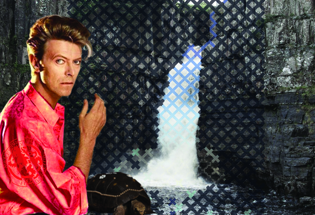
My parents used to take me to High Force waterfall in Teesdale quite regularly during my childhood. I remember it always being absolutely spectacular but freezing. I recall a giddy rush of school age knowingness when watching a repeat of the Michael Palin and Terry Jones comedy series Ripping Yarns and in one of the finer episodes – The Testing of Eric Olthwaite – a climactic scene was shot at the waterfall. My waterfall. Around the same time I became a David Bowie fan. Not just a “oh I quite like a couple of songs” type fan, but a proper fan. A “some of the b-sides are better than the a-sides” type fan. Honestly, it was (and still is) really quite ridiculous. At Sixth Form I wrote a short story for my English A-Level called “The Secret Life of Arabia” (which as you of course know is named after the final track on the “Heroes” album from 1977) within which it transpired that Bowie had been hiding in my shower cubicle scoping out my house for a big burglary he was planning. He would creep around as I slept and whisper to me about the Russian Revolution, polluting my dreams with detailed accounts of early twentieth century history. He’d also plant stupid thoughts into my brain via clues around the house – like to not let the water boil if you’re making a cup of coffee as the scalding water would kill the granules, thus destroying the flavour. You need to flick the switch off a few seconds before it boils in order to preserve taste. I was an odd kid. I dyed my hair “Bowie Orange” when I was at Salford Uni. My mum came to visit me once and didn’t recognise me. I dyed it back after being out at the Ritz in Manchester and some baggy saucer head kept calling me Thom Yorke all night. Some years later I’d write articles for influential music blogs about my love of his much maligned late 90s era and even plant little Bowieisms into my songs, just on the off chance that he’d hear one and throw me a post modern nod and a wink.
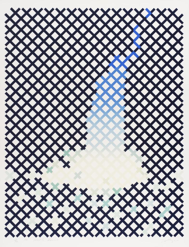
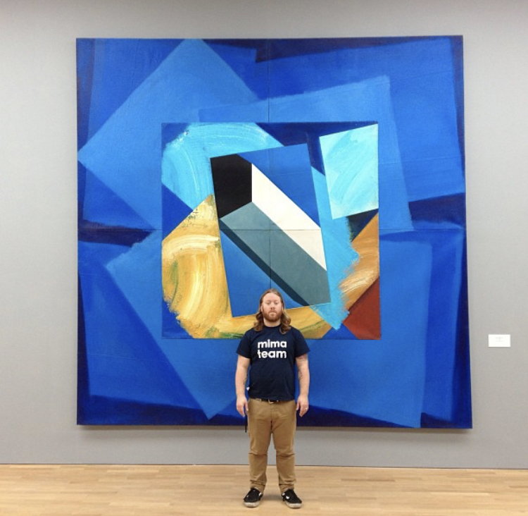
William Tillyer is an artist from Middlesbrough and I was lucky enough to assist in installing his show “Against Nature” at Middlesbrough Institute of Modern Art in 2013. It was the first time that the entire gallery space of the building had been dedicated to a single artist and it was a massive undertaking. There was so much work to install… so so so much work. There were frighteningly precise criss-crossy prints; huge floor filling constructions that were simultaneously abstract paintings and sculptures; beautiful delicate watercolours from his travels around the world including gorgeous sunsets in the South of France and mesmeric sketches of the architecture of Frank Lloyd Wright in Pennsylvania; elaborate abstract glassware; colossal paintings with gaping holes in them that were seemingly held together with the thickness of the gloopy paint and mesh; and supercool dark heavy paintings that tried to educate you in a couple of hundred years of art history and colour palettes and look awesome at the same time. The first thing you saw when you walked into the gallery was a 30ft high digitally manipulated watercolour print of the High Force waterfall – a modern reinterpretation of his 1974 original. It was absolutely HUGE.
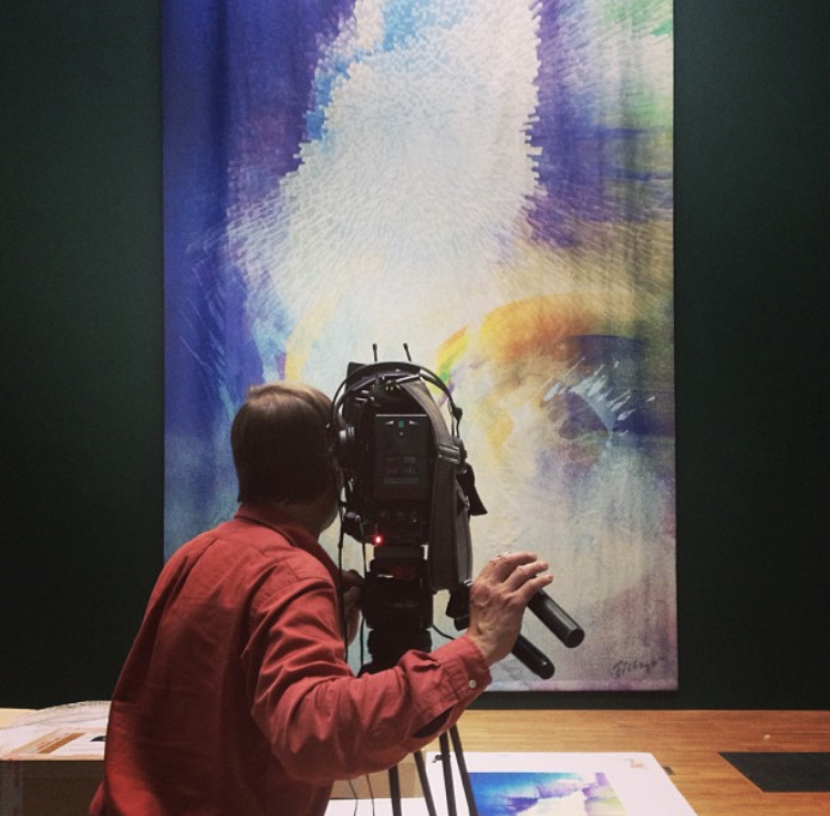
Installing artwork is never truly easy but it can be made easier by having fairly standard work to hang. A pretty little framed picture to hang on a couple of screws is fairly straightforward. It has to be precisely level and at the correct height but it’s not too difficult to do. On the other hand, a 30ft high print that hangs from the ceiling is quite difficult to do. Hardly any of Tillyer’s work could be classed as “fairly standard” to hang… and it filled the entire building!! So much work! But we got it done on time and it looked great, so well done us, pats on the back all round.
I enjoyed working with William Tillyer. He was a lovely approachable guy, reliably on hand to help us work out how to put one of his complex constructions together and always had time to stop and chat about the work itself if you asked about it or simply didn’t understand. I’ve mentioned previously that as well as installing artwork at Mima I also work as a gallery assistant/guide and my favourite time to gather information about shows is during the installation period, ideally from talking to the artists themselves. It’s during these times that you discover the quirkier bits of information that the more formal or educational gallery guides miss. My brain doesn’t always work in an artistic way – my attention span is goldfishesque and it takes me a lot of time to decipher “art speak” – so to get explanations in plain terms is invaluable to me. If I’m taking people round the gallery I want my guidance to be accessible, I don’t want to confuse visitors with pseudo intellectual babble, and in order to do this I need to understand and believe what I’m saying. Chats with artists at the coal face will always be tremendously useful to me so I actively search them out for factoids when we have a gallery full of wet paint signs.
Now even with all that being said… the first thing I took away from my chats with Tillyer was a yearning to read late nineteenth century French literature. Ha ha what. No, really! OK, this is a fairly simple nut to crack, please be patient. The show was titled “Against Nature”, which is the English translation of an 1884 novel by the French writer Joris-Karl Huysmans called “À rebours”, and Tillyer read the book as an art student. Simple. But the way Tillyer talked to me about this book was intriguing and I figured I could get a better insight into the show and to him by reading it, so I did. The book is absolutely nuts by the way: decadent and sensory, risky and ridiculous. It bored me to tears for entire chapters, then would leave me dumbstruck and dazzled in the space of a few paragraphs. The narrative focuses on a single character: Jean des Esseintes, an eccentric, self centred, reclusive, ailing fop. The last descendent of an aristocratic family, Des Esseintes loathes nineteenth century bourgeois society and tries to retreat into an idealistic arty world of his own creation in his daft little fancy house. The plot (if you can call it that) is almost entirely a catalogue of the neurotic Des Esseintes’ aesthetic tastes, ramblings on literature, painting and religion, and sensory experiences. Completely going against the mood of the times, he loved artifice and sparkling fakery over nature. The most famous passage of the book focuses on him fixing heavy gemstones to his pet tortoise, ultimately causing its death. He’s a ridiculous combination of Mick Jagger in his decadent 70s pomp and Tony Hancock’s flawed genius artist character in the film The Rebel. It’s all completely ludicrous and I don’t know if it made me understand the exhibition more but I enjoyed it nevertheless. From there (on Tillyer’s recommendation) I read another Huysmans book, La Bas (from 1891) which was a much much darker affair: a crazy investigation into historical occultism, descending into present day Satanism and culminating with a full on black mass. It was as if all the decadence and vibrant colour of his previous book had been stripped away leaving a cold, hard Parisian blackness. After this I flipped around his fin de siecle contemporaries to cheer myself up: Guy de Maupassant, Zola, and Gustave Flaubert. I realise that by listing a load of dandy old French authors makes me sound absolutely preposterous but the truth is I’ve never been much of a reader apart from Beano and Viz. However, I absolutely consumed those books like they were a half decent quorn chilli covered in hot sauce. I became overwhelmed with the ever crazier descriptions of decadence and whilst I didn’t quite become Des Esseintes (there was no way I was sticking diamonds on my dog) I definitely started to appreciate French wine more and more.

I’d heard whispers that there was a link between Tillyer and David Bowie and that one of the paintings we had in the show had been borrowed from the Main Man himself. I’ve mentioned before in a previous post about the weird feeling I get of standing in front of an artwork knowing that I’m in the same space as the artist when they were making it and every viewer that has ever seen it. It feels like I’m sharing my eyes and brain with all these people from the past at exactly the same time. A bit like Sam in Quantum Leap. A bit. Ask yer dad. In this case I wanted to be in the same space in front of the painting as my musical hero, I wanted to feel his emotions and reactions. He may have been in New York and I was in Middlesbrough but it would somehow bring us closer together, like a transatlantic Power Ranger. I chatted to Tillyer about Bowie. He showed me the piece Bowie owned, told me about other paintings that he’d bought and that he’d been to dinner with him near his New York apartment a few times. I was just like…woah.
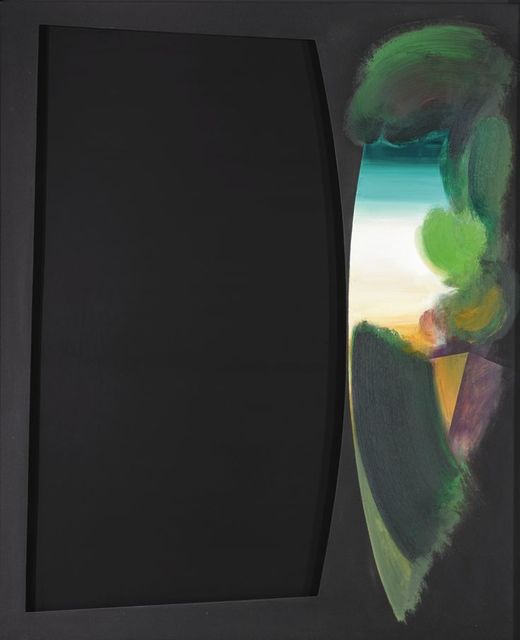
Tillyer is a quiet unassuming man, he’s not showy offy or arrogant at all, he just loves making artwork. That Bowie would fall for the art of this friendly fella from Boro didn’t initially make sense to me but eventually it all clicked. There’s more going on in these paintings from the 90s than initially meets the eye. They combine an attempt at being hyper modern [the big cut out void in the cool black box, surely a callback to the flatness of Matisse and Malevich, both heavy hitters on flatness and voids] with a throwback to the less modernist and more recognisable art of the past [the romantic colour palette on the right hand side suggests a lush painted landscape more akin to “proper painting” than this modern malarkey. To me the greens he uses are even recognisable as local colours, the muddy green of North Yorkshire]. Tillyer seems to be scampering about in a field of art history, picking away at various eras and styles like an artistic magpie. A bit of Turner here, a bit of cubism there, a bit of Constable here, a bit of Bauhaus there… And that’s the link between the two men… as Bowie did pretty much exactly the same thing throughout his career but with music not paint. Bit of Scott Walker here, bit of Velvet Underground there, bit of Anthony Newley here, bit of Nine Inch Nails there… They both unashamedly wear their influences on their sleeves to create something new and unique. Like Tillyer, there’s a sense of Englishness underpinning it all despite the shimmer of global modernism in his work. He may shift his accent to somewhere in the middle of the Atlantic and wear ridiculous corporate shiny suits but to me Bowie can’t avoid stinking of cups of milky tea in cracked mugs and cockney markets, just as Tillyer will forever be grounded in the North Yorkshire moorland.
